Color psychology is the study of how colors affect human behavior and perception. In design, it is important to understand the psychological effects of different colors in order to create effective and impactful designs.
Understanding color associations is also crucial in design. Different colors evoke different emotions and associations in people, and by choosing the right colors for a design, designers can effectively communicate their desired message or atmosphere. It is important to consider these associations and the cultural and gender associations of different colors in order to create cohesive and effective color palettes.
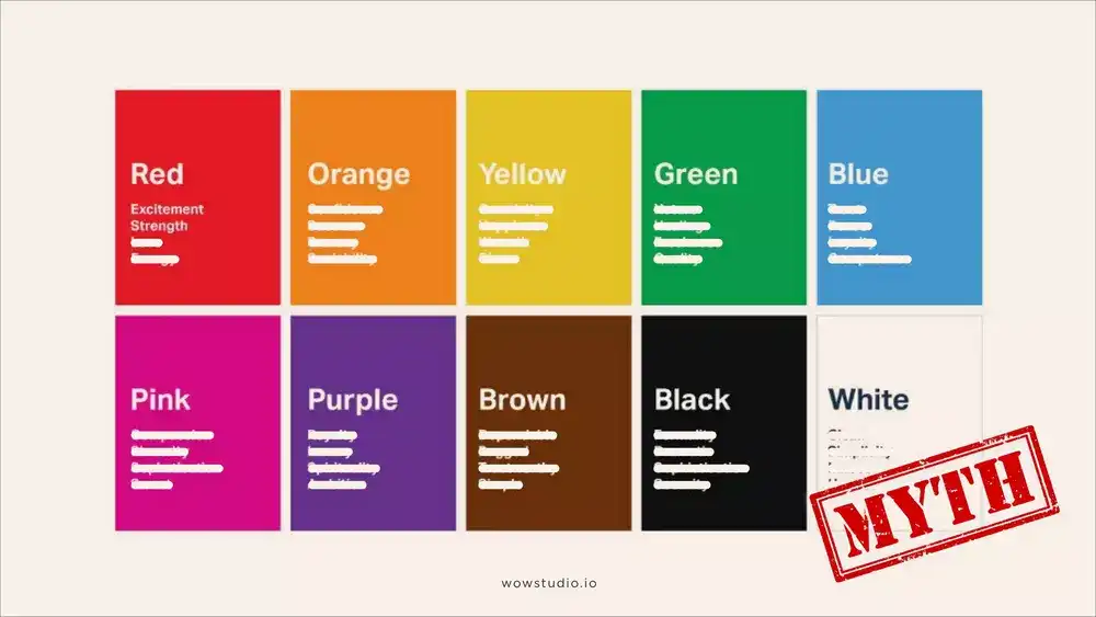
Examining the limitations of the traditional color psychology chart
When you search for color psychology online, the first thing you'll likely come across is a traditional color psychology chart. This chart associates certain colors with specific emotions and meanings. But is it really that simple? Can we really reduce the complexity of color psychology to a single chart? The answer is no. In fact, relying on traditional color psychology charts can be misleading and anecdotal at best.

Emphasis on scientific research and evidence-based studies
In this blog post, we discuss the importance of scientific research and evidence-based studies in understanding color psychology and its relevance to design. By considering this research and evidence, we are able to present accurate and reliable information and provide practical tips for designers on how to incorporate color psychology into their work. Basing our understanding of color psychology on scientific research, rather than anecdotal or traditional beliefs, is crucial for creating effective designs.
Brief history and origin of color psychology:
The study of color psychology has a long history, with the earliest recorded observations on the psychological effects of color dating back to ancient civilizations. The ancient Egyptians believed in the therapeutic properties of certain colors¹, while the ancient Greeks associated different colors with specific emotions and virtues².
In the modern era, the study of color psychology began to take on a more scientific approach with the work of German philosopher Johann Wolfgang von Goethe, who wrote extensively on the psychological effects of color in the late 18th and early 19th centuries. In the 20th century, the study of color psychology was further developed by researchers such as Faber Birren, who wrote extensively on the subject and developed the first systematic approach to studying the psychological effects of color.
Color psychology is an important field that has gained a lot of attention in recent years, particularly in the fields of marketing and branding. However, it is worth noting that the study of color psychology is not as well researched or studied as some other subjects, despite its importance in these areas³. There is still much to learn about the psychological effects of color and how it can be used effectively in design and marketing. While the field of color psychology has made significant strides in recent years, there is still a need for more research and study in order to fully understand the ways in which color can impact human behavior and perception.
The impact of color on consumer behavior and perception in design and marketing:
Color psychology matters in design and marketing because it can significantly impact how people perceive and interact with a product or brand. According to a study published in the Journal of Marketing, the color of a product's packaging can affect consumer perceptions of the product's quality. In the study, researchers found that products with red packaging were perceived as higher in quality compared to those with yellow or white packaging, with 66% of participants rating red-packaged products as high quality, compared to only 24% for yellow and 20% for white.⁴
Similarly, according to a study published in the journal, Psychology & Marketing, the use of color in advertising can influence consumer attention and memory for the advertised product. The study found that advertisements with color were more likely to be remembered than those in black and white, with a recall rate of 85% for color ads, compared to only 56% for black and white ads.⁵
Color can also affect people's emotions and associations with a product or brand. According to a study published in the journal, Perceptual and Motor Skills, certain colors, such as red and yellow, were more effective at attracting attention and eliciting an emotional response, while other colors, such as blue and green, were more effective at inducing feelings of calm and relaxation.⁶
By considering the psychological effects of color, designers can effectively use color to communicate their desired message or atmosphere and create a cohesive and effective brand identity.
Overview of how color psychology works:
As stated earlier, color psychology refers to the study of how color affects human behavior and perception. There are several theories that attempt to explain how color psychology works, including 'The Evolutionary Theory' and 'The Ecological Valence Theory.'

1. The Evolutionary Theory:
The evolutionary theory of color psychology suggests that certain colors have evolved to be preferred by humans and animals because they provided some evolutionary advantage. For example, the color red is thought to have evolved as a signal of danger or aggression because it is the color of blood, which is a sign of injury or threat. Similarly, the color green is thought to have evolved as a signal of safety or nourishment because it is the color of most plants, which provide food and shelter.
One aspect of the evolutionary theory of color psychology is the idea that certain color preferences may have evolved as a result of their adaptive significance for different roles in human society. For example, research has suggested that the ability to discriminate red wavelengths may have been more important for foragers (i.e., females) than for resource protectors (i.e., males), and this may have contributed to contemporary visual biases (Alexander, 2003, p. 11).⁷
There is some evidence to support the evolutionary theory of color psychology. For example, a study published in the journal, Evolution and Human Behaviour found that people from different cultures preferred the same colors for similar reasons, such as red for danger and green for safety. Another study published in the journal Animal Behaviour found that animals also prefer certain colors for similar reasons, such as red for aggression and green for safety.⁸
2. The Ecological Valence Theory:
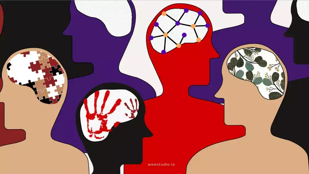
The Ecological Valence Theory is a theory in color psychology that suggests that color preferences are influenced by the environment in which they are viewed and the experiences and associations that a person has with that color. This theory is based on the idea that the human brain has evolved to form preferences for certain colors based on their association with certain experiences or outcomes.
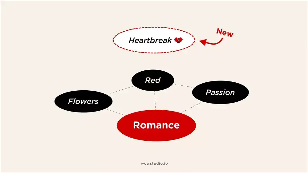
Your brain has a web of knowledge. Consider your concept of "romance".
If you enjoy romantic dinners, you might prefer the color red because it is often associated with passion and love.

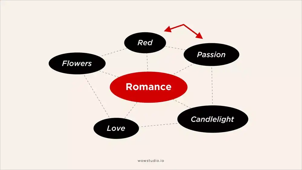
However, if you have had a painful breakup with someone who always wore red, suddenly red may become less appealing to you.

There is evidence to support the Ecological Valence Theory, including studies that have found that color preferences can change based on the context in which they are viewed and that personal experiences, cultural background, and the environment can all influence how a person responds to a specific color. For example, a study published in the journal Environmental Psychology found that people living in environments with more green space had a higher preference for the color green than those living in more urban environments.⁹ Another study published in the journal Emotion found that the color of a room can influence people’s emotional state.
In summary, the Ecological Valence Theory suggests that color preferences are influenced by the environment, personal experiences, cultural background, and other factors such as gender and age. This theory helps to explain why different people may have different preferences for certain colors and how these preferences can change based on different contexts.
Other theories that attempt to explain how color psychology works, in addition to the Evolutionary and the Ecological Valence theories are:
1. The symbolic meaning theory:
This theory suggests that color preferences are influenced by cultural and symbolic meanings attached to different colors. For example, in Western cultures, white is often associated with purity and innocence, while black is often associated with death and mourning.
2. The physiological effects theory:
This theory proposes that color preferences are influenced by how colors affect the body physically. For example, color red can increase heart rate and blood pressure, while blue has a calming effect.
The social identity theory:
This theory suggests that color preferences are influenced by the groups a person belongs to or identifies with. For example, someone who is part of a sports team may prefer the team’s colors, or someone who identifies as punk may prefer the colors associated with that subculture.
Overall, it is likely that color preferences are influenced by a combination of these and other factors, such as personal experiences, cultural background, and context.
Factors that influence color associations
Color associations are not universal and can vary based on a number of factors. These include:
1. Personal experiences:
Personal experiences can influence color associations. For example, if a person has had happy memories associated with the color yellow (such as receiving compliments on their yellow shirt), they may associate yellow with happiness and form a preference for the color. On the other hand, if a person has had negative experiences with the color yellow (such as getting sick after consuming bright yellow food), they may associate yellow with negative emotions and form a dislike for the color.
2. Cultural background:
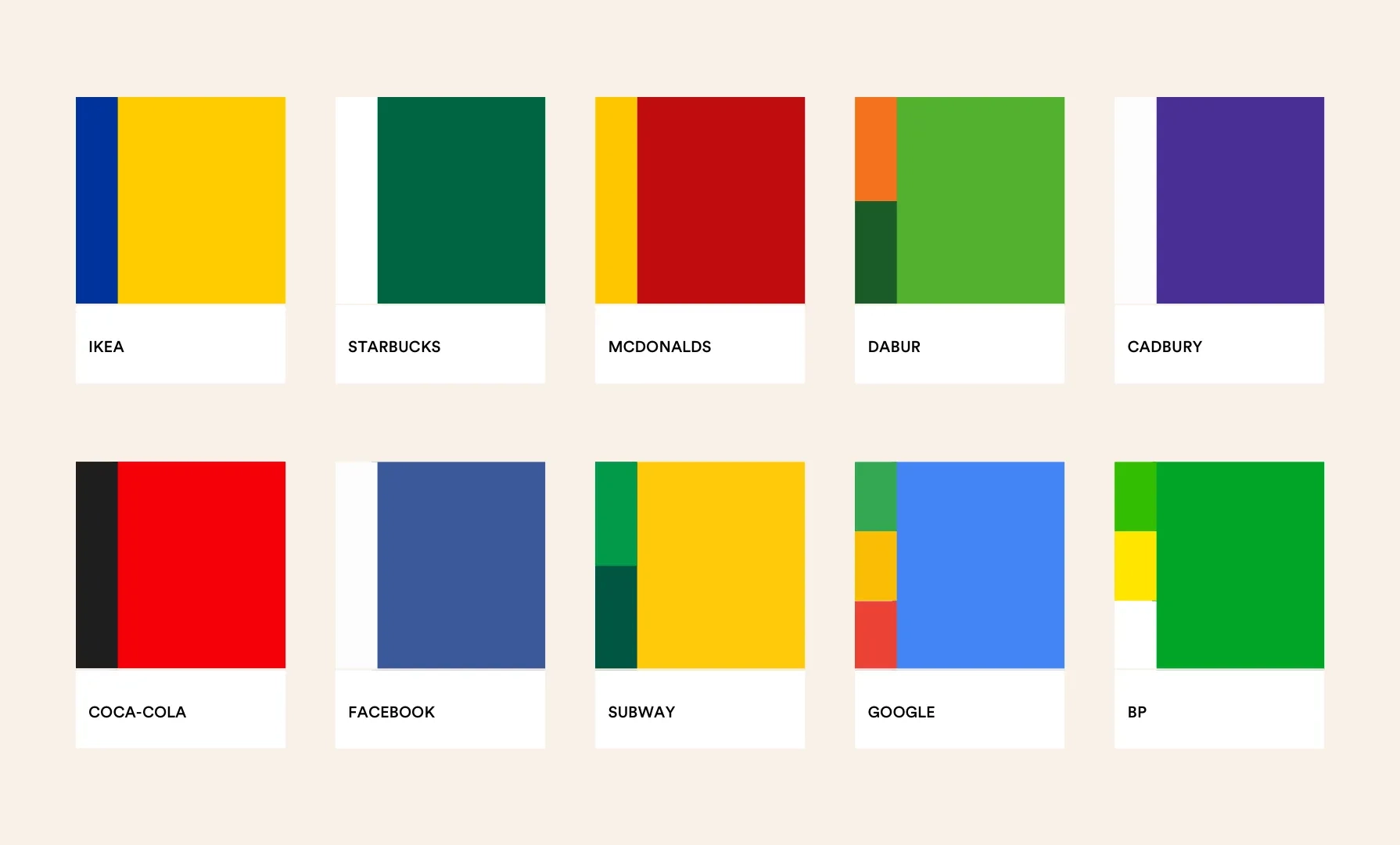
It is not uncommon for certain colors to be culturally significant in different parts of the world. In the Indian subcontinent, for example, the colors orange and green are often associated with religious and cultural traditions. Orange is often associated with Hinduism and is often worn by Hindu holy men, while green is often associated with Islam and is often used in Islamic art and architecture.
These cultural associations can affect how people from these regions perceive and respond to these colors. A person from the Indian subcontinent who grew up surrounded by orange may associate it with spirituality and positive emotions, while someone from a different cultural background may not have the same associations with the color.
3. Context and surroundings:
The context and surroundings in which a color is encountered can also influence color associations. For example, the color red may be perceived as romantic or passionate in a bedroom, but as aggressive or threatening in a traffic signal. The same color can be perceived differently depending on the context in which it is encountered.
4. Gender and age:
Research has found that gender and age can also influence color associations. For example, a study published in the journal Sex Roles found that men and women tend to have different color preferences. Men tend to prefer darker, more vibrant colors, while women tend to prefer softer, pastel colors. Children tend to prefer brighter, more saturated colors, while adults tend to prefer more muted, subdued colors.¹⁰
4. Tints, tones, and shades of colour:
The tints, tones, and shades of a color can also influence the way it is perceived. A tint is a color with white added to it, which can make it appear lighter and softer. A tone is a color with gray added to it, which can make it appear more muted or subdued. A shade is a color with black added to it, which can make it appear darker and more intense.
For example, a light blue may be perceived as calming and soothing, while a dark blue may be perceived as more serious or formal.
Overall, there are many factors that can influence the way we perceive and associate different colors. Personal experiences, cultural background, context, gender and age, and the tints, tones, and shades of a color can all play a role in how we respond to different colors. Understanding these factors can help us to better understand the role that color plays in our lives and how it can be used effectively in different contexts.¹⁰
Tips for designers on how to incorporate colour psychology into their work:
As designers, it’s important to consider how color psychology can influence the impact and effectiveness of our designs. Here are some tips on how to incorporate color psychology into your work:
1. Use a color palette to reflect mood or message:
One way to incorporate color psychology into your design is to choose a color palette that reflects the desired mood or message of your design. For example, if you want to create a calming and relaxing atmosphere, you might use a palette of soft, pastel colors. On the other hand, if you want to create a bold and energetic atmosphere, you might use a palette of vibrant, bold colors.
2. Consider the target audience:
It is important to consider the target audience when incorporating color psychology into your design. Different colors can have different meanings and associations for different people, so it’s important to consider who your design is intended for and what colors they may respond to.
3. Use color symbolism:
Color symbolism involves using certain colors to represent specific ideas or emotions. For example, the color red is often associated with passion and energy, while the color blue is often associated with calmness and trust. By using color symbolism in your design, you can help convey the desired message or emotion to your audience.
4. Use color theory:
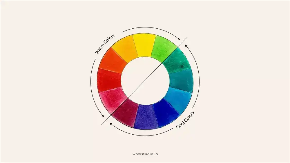
Color theory is the study of how colors interact with each other and how they can be used to create harmonious and effective color combinations. The most common tool used in color theory is the color wheel, which is a visual representation of the relationships between different colors. The color wheel is divided into primary, secondary, and tertiary colors, and it can be used to create color schemes that are complementary, analogous, monochromatic, and many more.
One important factor to consider when incorporating color psychology into your design is the temperature of the colors you are using. Warm colors, such as red, orange, and yellow, are often associated with emotions such as passion, energy, and enthusiasm. Cool colors, such as blue, green, and purple, are often associated with emotions such as calmness, trust, and serenity.¹¹

Research has shown that the temperature of a color can have a significant impact on the psychological effects it has on viewers. It is important for designers to consider the temperature of colors when creating a color palette.
For example, a study published in the journal Emotion found that warm colors were more likely to elicit positive emotions and behaviors, while cool colors were more likely to elicit negative emotions and behaviors.¹¹ Another study published in the journal Environment and Behavior found that warm colors were more likely to increase arousal and attention, while cool colors were more likely to decrease arousal and attention.¹²
Incorporating color psychology into your design work can have a significant impact on the effectiveness of your designs. Some tips for using color psychology in your work include choosing a color palette that reflects the desired mood or message of your design, considering the target audience and their associations with different colors, using color symbolism
Key takeaways:
In conclusion, Color psychology plays a crucial role in design and marketing, as the colors we use can influence the emotions and behaviors of our target audience. It is important to consider personal experiences, cultural background, context and surroundings, gender and age, and tints, tones, and shades of color when choosing colors for a design. Colour psychology is a precursor to colour theory and implementation of colour usage in design processes. It is a complex subject that needs to be studied well and treating this area of design casually can lead to undesirable outcomes. If not used cautiously, it can become a double edged sword in a sense that things could be perceived completely different from what was originally intended by the designer.
Some tips for incorporating color psychology into design work include using a color palette that reflects the desired mood or message, considering the target audience and their associations with different colors, using color symbolism to convey specific ideas or emotions, and experimenting with different color combinations. By combining color psychology with color theory, designers can create practical color palettes that effectively communicate the desired mood or message to their target audience, but if proper expertise is not employed, things can quickly turn south and lead to misleading outcomes.
Thanks for reading! Please leave a comment and share this article if you enjoyed it. Follow me on Medium for more design tips and insights. Thank you for your support!
References:
- [1].“Colour and Meaning in Ancient Egypt”-Sally Henson
- [2].“Colour and Meaning in Ancient Egypt”-Eirini Fafaliou
- [3]."The Study of Color Psychology: A Review”-David Meyers & Andrew Elliot
- [4]."Journal of Marketing, 62(1), 46–57.”-Grieser, K. L., & Suziedelis, 1998.
- [5]."Psychology & Marketing, 26(5), 385–403”-Mehta, R., & Zhu, R. J. (2009).
- [6].Perceptual and Motor Skills”-Mehta, R., & Zhu, R. J. (2009).
- [7]."Alexander, p. 11.”- (2003).
- [8]."Effect of Color on Animal Behavior”-V. V. Egorov, 2017.
- [9]."Environmental Psychology”-June 2014.
- [10]."Sex Roles, 8(1), 1–9”-Gorn, G. J., & Goldberg, M. E. (1982).
- [11]."Emotion, 13(5), 669–680.”-Anesth Prog. 2012.
- [12]."Environment and Behavior, 37(4), 659–671."