Primary brand colours play a crucial role in establishing a consistent and recognisable visual identity for your brand. These colours are often a key component of your company’s logo and are typically limited to 1-3 hues. The right primary colours can influence how your brand is perceived by your target audience, leading to increased brand recognition, customer loyalty, and sales.
In this blog series, we’ll cover the complete process of selecting colours for your brand. However, at this stage we’ll solely focus on selecting primary brand colours, and examine the various factors to consider when choosing primary brand colours, including colour psychology, brand personality, competitor research, etc.
But before we dive in, it’s essential to understand the basics of colour psychology. Colour psychology is the study of how colours impact human behaviour and emotions, it’s a complex and multi-faceted field. The interpretation of colours can vary widely and are dependent on multiple factors.
For a detailed take on colour psychology, check out my previous article:“The truth about colour psychology in design: Is it worth the hype?”.
Points to cover before you choose brand colours:
To select primary brand colours, it’s important to consider:
- 1. Your target audience.
- 2. Brand characteristics and values.
- 3. Cultural and geographical context.
- 4. Competitors and market trends.
Step 1: Identifying Target Audience / Demographics
One of the most important steps in selecting primary brand colours is identifying your target audience. Your target audience will have a significant impact on the colours you choose for your brand.
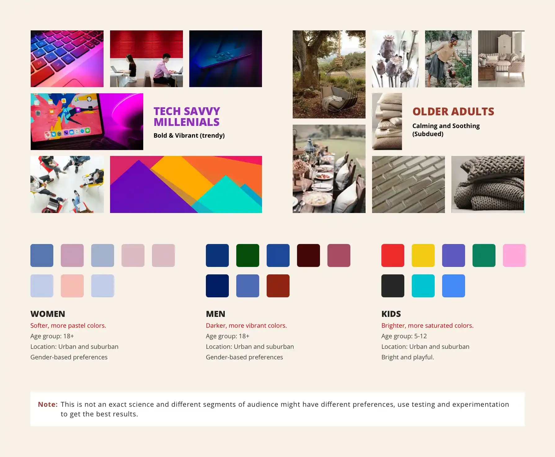
- To identify your target audience, gather information about their demographics such as age, gender, income level, education level, and geographic location.
- This information can be collected through surveys, focus groups, and customer data analysis. Create a buyer persona, a fictional representation of your ideal customer, to understand their wants, needs, and pain points.
- For example, if your target audience is primarily young, tech-savvy millennials, you might choose bold and vibrant colours as they respond well to trendy colours. On the other hand, if your target audience is older adults, you might choose calming and soothing colours as they prefer more subdued colours.

Step 2: Identifying Brand characteristics and values
This step is all about understanding your brand’s identity, values, and mission. These elements will help you determine the overall tone, mood, and message you want to convey through your brand’s colour scheme.
- Start by defining your brand’s characteristics. What makes your brand unique? What words or phrases would you use to describe it? Some examples could include “innovative,” “reliable,” “luxurious,” “fun,” “professional,” etc.
- Next, identify your brand’s values. What are the core principles that guide your brand? Examples could include “sustainability,” “transparency,” “customer service,” “innovation,” etc.
- Once you’ve defined your brand’s characteristics and values, you can start to think about how you want to convey them through colour. For example, if your brand is “innovative,” you might choose a bold, bright colour palette to convey a sense of energy and forward-thinking. If your brand is “sustainable,” you might choose a more muted, earthy colour palette to convey a sense of environmental responsibility.
Use these brand characteristics and values to guide your colour choices. It will give you a clear picture of what colours should be used and which should be avoided.
Step 3: Identifying Geography and Cultural Significance
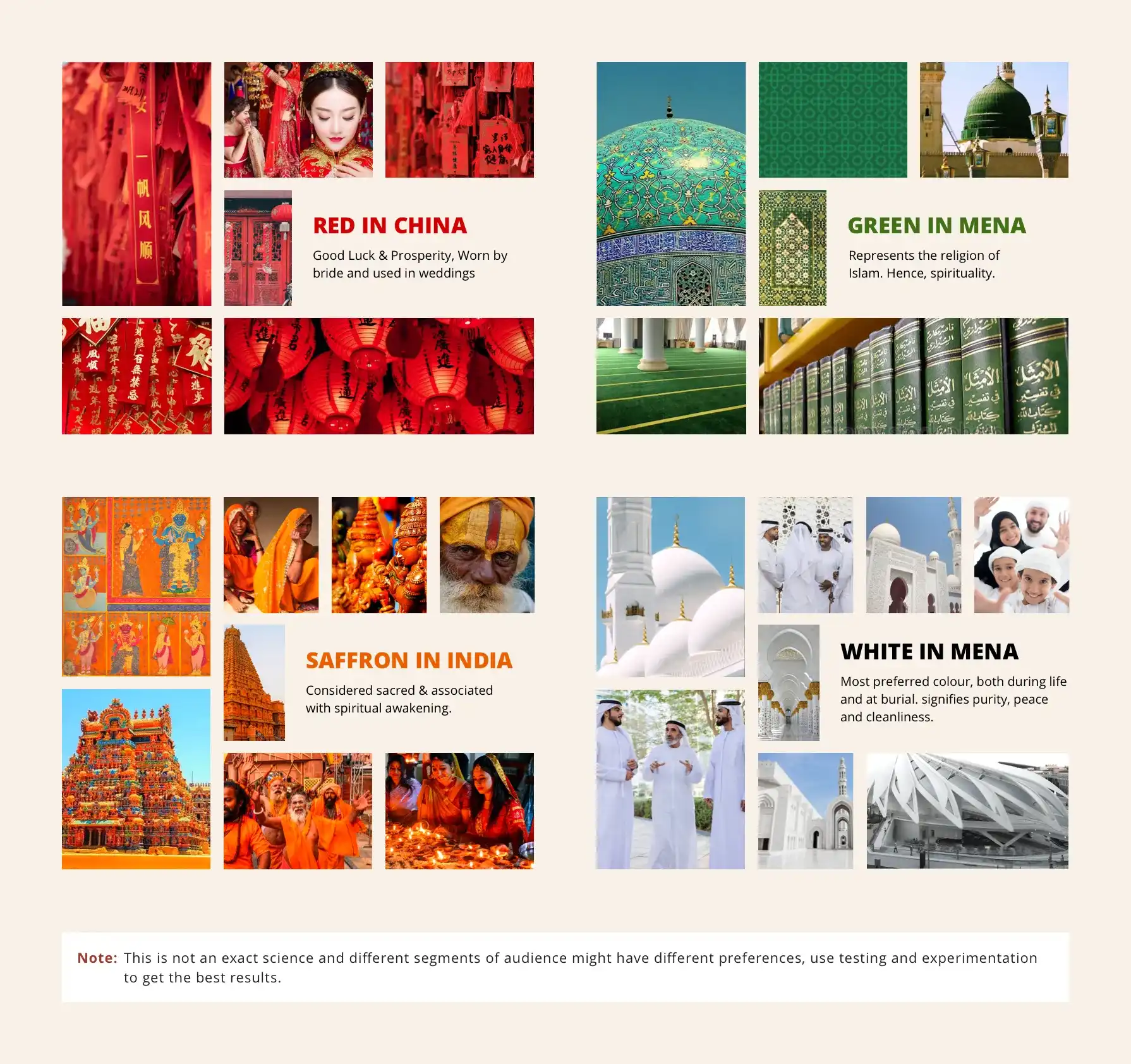
It’s about understanding how the culture and location of your target audience may influence the perception of colours.
- In the Middle East and North Africa (MENA) region, for example, green is often associated with the Islamic faith and is popular in branding and marketing. Similarly, in the Indian subcontinent, red is often associated with marriage.
- Be aware of these associations to ensure your brand is received positively by your target audience. Research cultural and regional colour associations through studies, and consulting with local experts or marketing research firms.
- It’s also important to create a mood board in the local language if the brand is targeting that region, which can help prevent visual gaps.

Step 4: Researching and analysing competitors
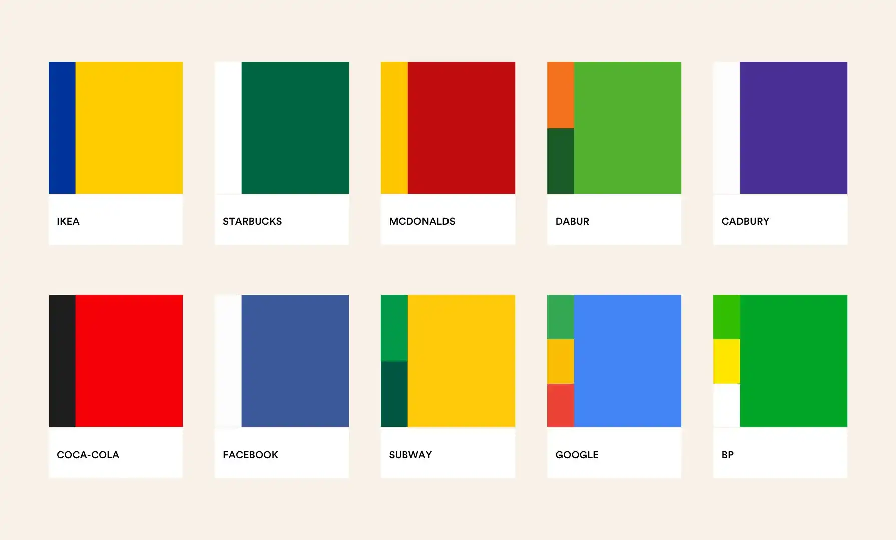
Research your competitors’ colour choices and market trends to inform your own. You can either blend in or stand out. Consider the potential benefits and drawbacks of each approach.
- Blending in with similar colours of established brands can help your brand build trust, and be easily recognised and accepted by your target audience, especially if you’re a new player in the market. However, it can also make your brand less distinctive and memorable.
- Standing out with unique colours to convey innovation can help your brand be more easily distinguished from your competitors and make a stronger impact. However, it can also make your brand less familiar and comfortable to your target audience.
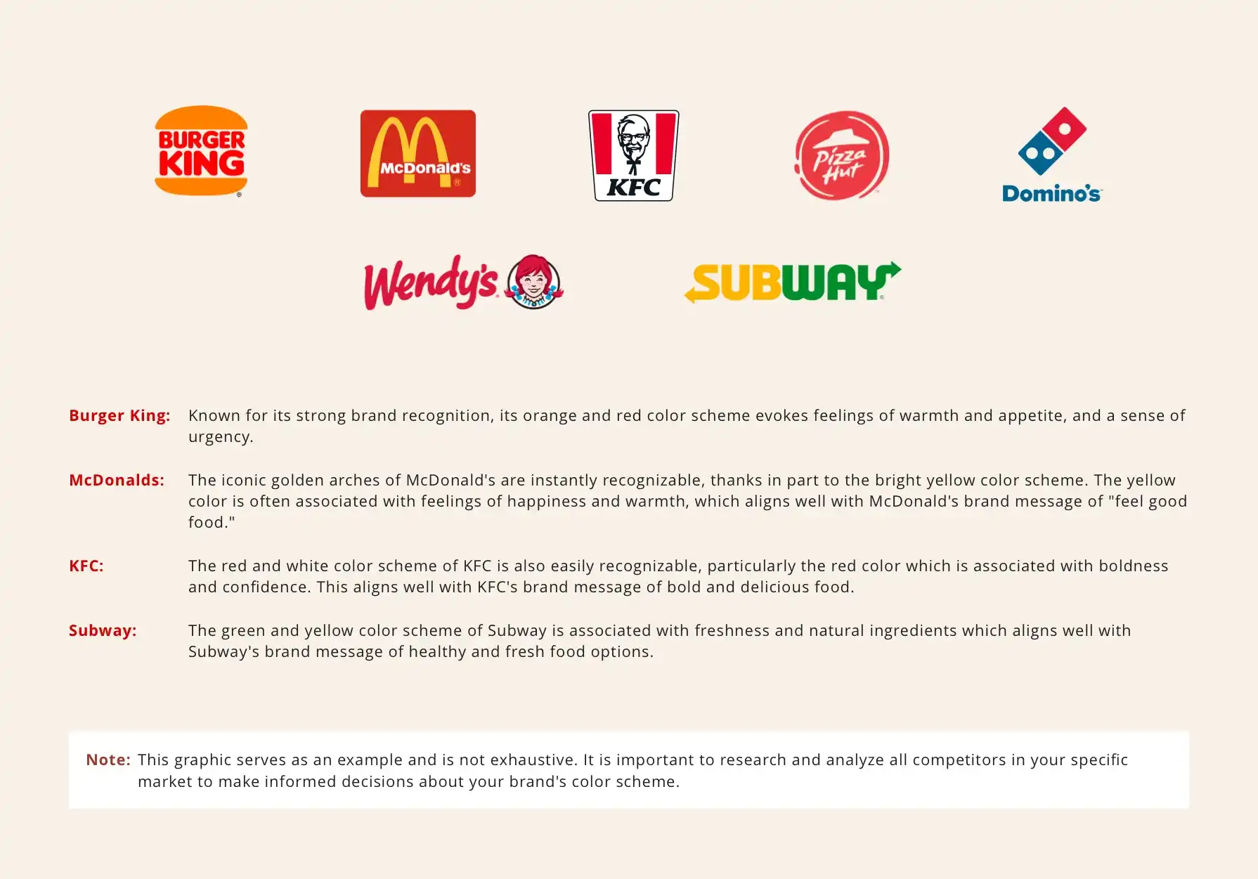
- For example, if you’re starting a fast food brand, you may notice that many of the major players in the market, such as McDonald’s, Wendy’s, and Burger King, use red and yellow as their primary brand colours. While blending in with the competition by using similar colours can establish trust and recognition, using a different colour like green, like Subway, can help you stand out and differentiate your brand.
Also, keep track of industry colour trends for insights on popular and well-received colours. Use these insights to make informed decisions about your brand’s colour choices.

Selecting Primary Brand Colors
Step 1: Analysing Results and Determining Color Options
In this step, we take the findings from the four steps and determine the most suitable colour options for the brand “XYZ”. Our aim is to convey the brand's personality and values to its target audience along with establishing the desired colour mood and tone.
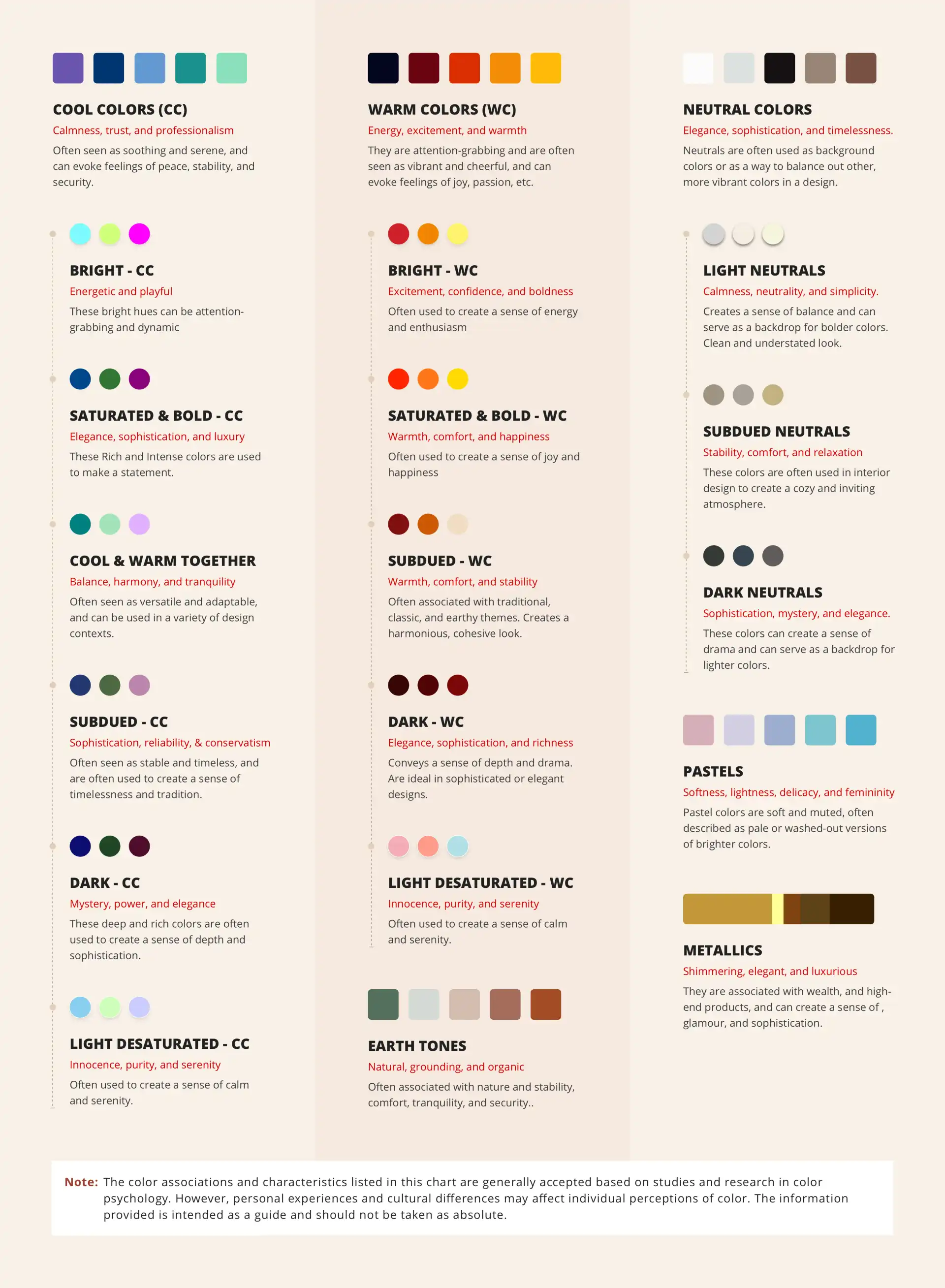
To establish the colour mood, consider the emotions you wish to evoke in your target audience. For instance, if you want to create a sense of calmness and tranquillity consider using cool colours such as greens, blues and neutral earth tones. On the other hand, if you want to inspire positivity and energy think about using warm colors such as pinks and peaches.
To determine the colour tone consider the level of saturation and brightness in your colour palette. If you’re looking for bold, attention-grabbing colours, opt for bright, saturated hues. On the other hand, If you prefer a more understated look, consider subdued and desaturated hues.
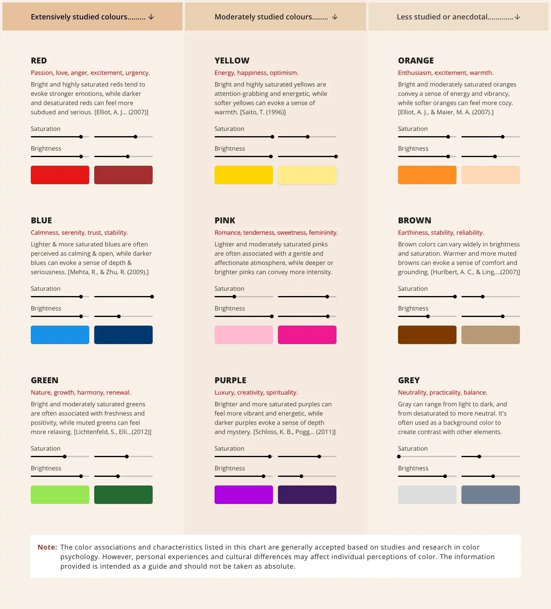
Note: The charts below offer colour meanings for reference. An in-depth blog on colour meanings and limitations could be published upon demand.


For example:
The brand “XYZ” is a premium skincare brand that targets well-educated, health-conscious women aged 25-45. The brand emphasizes the use of organic ingredients. Takes pride in its eco friendly practices.Research indicates that the target audience values environmental-friendly products and is drawn to brands that prioritise their health.
Competitor analysis reveals that many premium skincare brands use greens and blues to convey their commitment, to being eco-friendly and natural.
“XYZ” aims to differentiate itself from the competition.
Based on these findings we can consider the following colour choices, for the brand “XYZ”;
- Option 1: A cool palette of subdued greens, blues, and neutral earth tones. These colours are often linked to promoting well-being and environmental consciousness making them a perfect fit, for the brands' eco-friendly approach. The cool temperature and subdued hues can evoke a sense of refreshment and relaxation.
- Option 2: A warm palette of light and desaturated pinks and peaches that exude warmth and tenderness. These colours are commonly associated with femininity which aligns with the brands' target audience. They also bring forth feelings of comfort and cosiness making them an ideal choice for products focusing on beauty.
- Option 3: A neutral palette of classic black, white, and greys. These timeless colours symbolize sophistication, luxury and minimalism. They convey a sense of elegance and exclusivity that perfectly complements the brands' emphasis, on premium quality products.

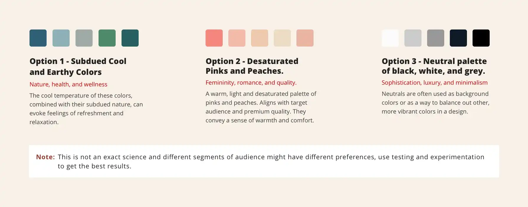
Each of these options appeals to different aspects of the brand’s target audience, values, and mission. Brands must experiment with different hues and saturations to discover an appropriate fit. Once the colour options have been narrowed down, the brand can proceed to the next step.
Step 2: Selecting Primary Colors Within the Mood and Tone
With the colour mood and tone determined, it’s time to finalize the primary colour hues that will define your brand’s visual identity. The specific colours you choose have a significant impact on how your brand is perceived.
Consider the interplay of hue, saturation, and brightness when selecting primary colour hues. Bright and saturated warm colours evoke distinct emotions like power, passion (red), joy and optimism (yellow), and enthusiasm (orange). Similarly, bright and saturated cool colours evoke feelings of trust and calm (blue) and growth (green).
In cases of less saturated and brighter or high-saturated and darker colours, individual psychological associations may not be as pronounced, but they work together cohesively to create a mood.
To refine your primary colour hues:
- Decide on the number of primary colours (commonly 1-3) required, primarily based on your logo. Skip step 2 if you need only 1 primary colour.
- Explore how primary hues interact with each other. Test combinations visually and emotionally, considering enhancing effects and message alignment.
- Think about primary hues across touchpoints, maintaining consistency across logo, website, packaging, and marketing materials.
- Seek feedback from colleagues, experts, or potential customers to gain valuable insights.
- Finalise primary hues based on exploration, testing, and feedback that aligns with your brand’s personality and intended emotional impact.
For our fictional brand “XYZ,” they chose Option 1: Subdued cool and earthy colours to align with nature and wellness. They focused on two primary colours:

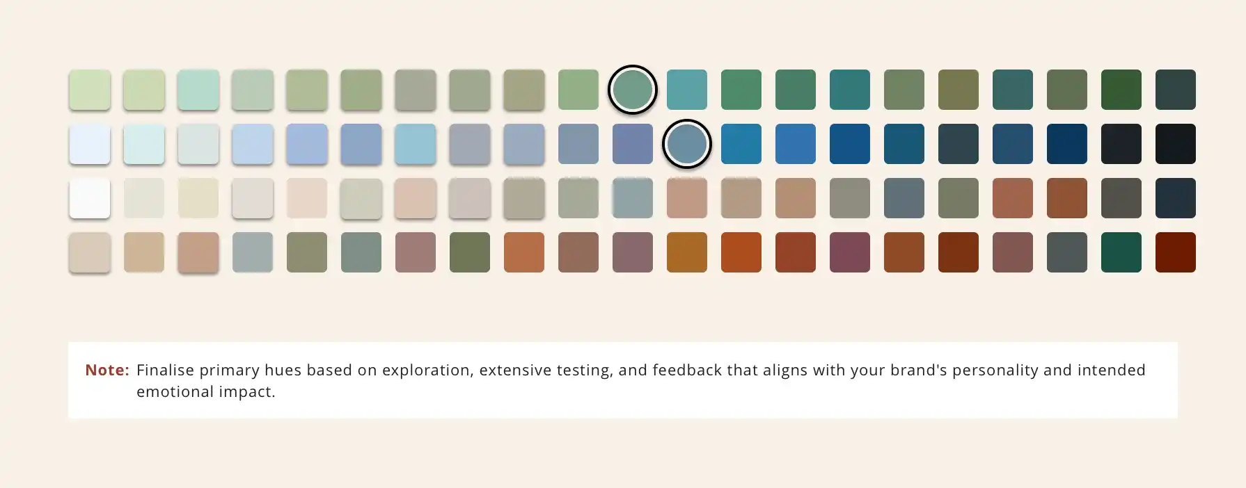
Primary Color 1: Subdued Green — Reflects commitment to nature, health, and harmony. Evokes calmness and wellness.
Primary Color 2: Subdued Blue — Corresponds with trust, stability, and reliability. Creates a sense of peace.

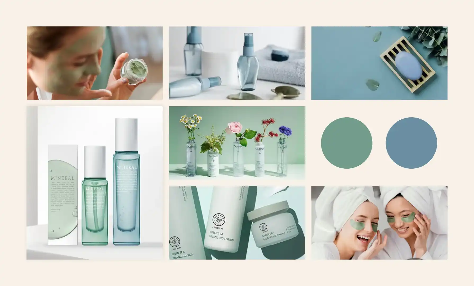
Strategically crafting a primary colour palette that deeply connects with your audience and reflects the essence of your brand will help establish a memorable and lasting visual identity. Remember, the process is iterative, requiring testing and refining to evoke desired emotional responses and effectively portray your brand.
Conclusion
In this blog, we covered the essential steps of selecting primary brand colours that resonate with your brand’s identity and values. By factoring in colour psychology, target audience, brand characteristics, etc. We’ve gained insights into crafting a colour palette that communicates effectively.
In the upcoming blog, we’ll delve into the fascinating world of colour theory to explore secondary colour palettes that complement your primary colours and the significance of accent colours. We’ll discuss harmonious combinations to enhance the visual identity and convey certain emotions.
Stay tuned for more insights and practical tips as we continue the exploration of colour in branding. Whether you’re a seasoned designer or new to the realm of branding, this series aims to provide you with the knowledge to make informed colour decisions that resonate with your target audience and establish a powerful brand identity.